Researchers discovered that switching to a font that was more suitable for the reader increased reading speed while preserving comprehension.
Researchers at the University of Central Florida have discovered that there is no one-size-fits-all approach for digital reading and that changing the font style and size can speed up reading while keeping comprehension. Imagine it as prescription glasses for the digital age.
The findings were published recently in ACM Transactions on Computer-Human Interaction (TOCHI).
The Readability Consortium at UCF conducted the study, which revealed that switching to a font that was more suitable for a particular reader resulted in a 35% boost in reading speed while maintaining comprehension. The researchers analyzed people’s reading speeds and comprehension levels while reading material in different typefaces.
The Readability Consortium, a partnership of UCF, Adobe, Readability Matters, and Google, researches digital readability in order to increase reading comprehension and reading speed.
Personalization Key to Optimized Reading
According to study co-author and associate professor of UCF’s Department of Industrial Engineering and Management Systems Ben Sawyer, ’14MS ’15PhD, director of the Readability Consortium, personal preference for fonts does not always predict reading speed, the study also revealed that people weren’t always aware of their ideal fonts.
“These results emphasize that personalization is key and encourage future work in creating tools and conducting research that helps readers discover the format that optimizes their personal reading experiences,” Sawyer says.
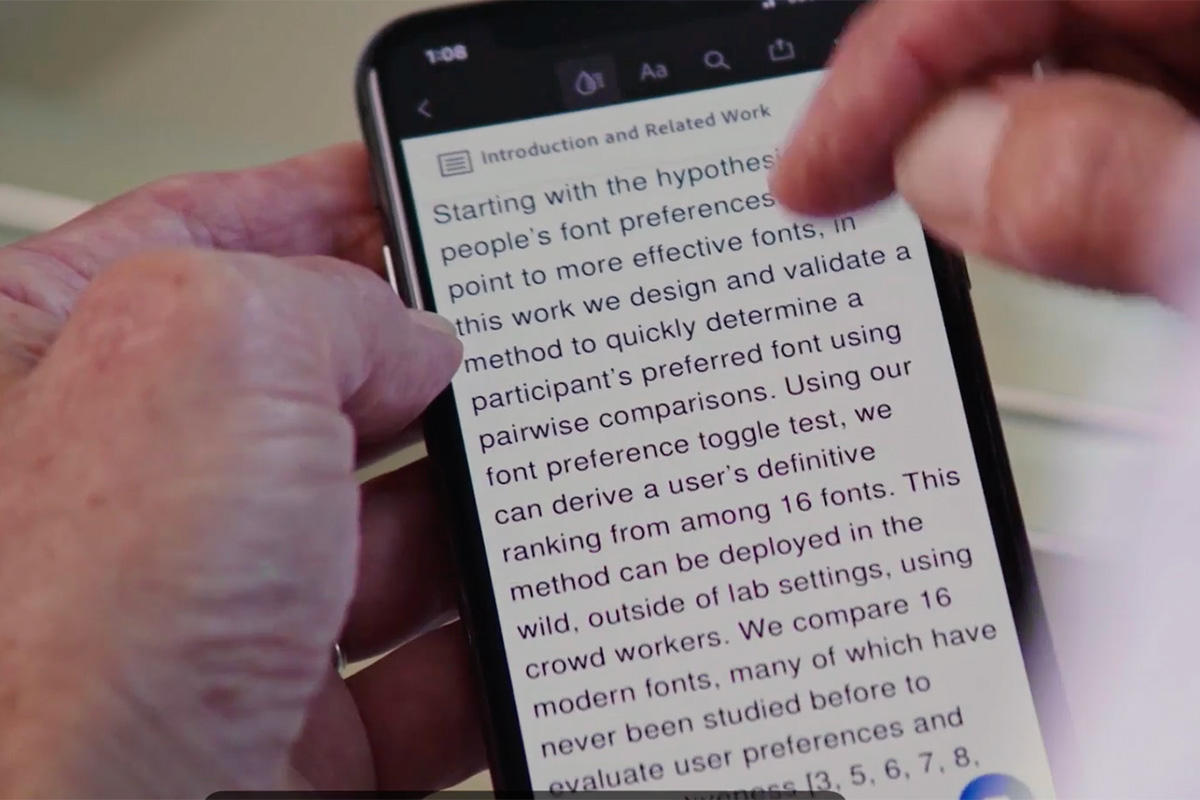
For the study, a diverse group of 352 participants, ages 18 to 71, were tasked with reading digital text on their personal devices. Sixteen common fonts used online, in newsprint, and in PDFs were tested.
Shaun Wallace, Adobe Research intern and Brown University computer science doctoral candidate, led the study.
Fonts as “Prescription Glasses” for Reading
“This research shows that we should start looking at fonts the way we look at reading glasses,” Wallace says. “With the right font, we can reshape how an individual sees text to help them read faster. This research is just beginning, as we can explore all facets of how to redesign text to match an individual’s needs.”
The Readability Consortium and Virtual Readability Lab lead UCF’s research on digital readability using individuated typography to improve reading speed and comprehension. Readability describes the ease with which people can read and understand the text. It is dependent on presentation factors, such as font and spacing. Individuated typography involves the personalization of font or reading experiences.
The consortium is conducting various digital readability studies to investigate the effects of how manipulating text characteristics such as font type, size, and spacing may boost reading speed and comprehension among both adults and children.
The efforts contribute to the consortium’s goal to build models and personal tokens that will match readers to the font format that will optimize their overall reading experience by improving reading speed and comprehension.
People can take the five-minute Virtual Readability Lab tests to discover the font and spacing that will help them read better.
Reference: “Towards Individuated Reading Experiences: Different Fonts Increase Reading Speed for Different Individuals” by Shaun Wallace, Zoya Bylinskii, Jonathan Dobres, Bernard Kerr, Sam Berlow, Rick Treitman, Nirmal Kumawat, Kathleen Arpin, Dave B. Miller, Jeff Huang and Ben D. Sawyer, 31 March 2022, ACM Transactions on Computer-Human Interaction.
DOI: 10.1145/3502222
Never miss a breakthrough: Join the SciTechDaily newsletter.
Follow us on Google and Google News.
9 Comments
So what was the font?
Definitely not the one used in this article.
Haha, Sebastian 💯
I have intractable migraines and digital,sustained reading is impossible. Blue light, is not an issue. Maybe think about improvements for those with disabilities.
Agreed with Sebastien. This was the most frustrating article to read.
For migraine increase refresh rate on computer. Use blue light filter and read with fl 41 rose tinted lenses or other migraine glasses
Previous research about reading printed matter such as books has shown that Roman lettering, such as Times Roman, is easier to read than sans-serif lettering such as Helvetica.
I found that in my own research for myself. I don’t understand why Arial or any other sans serif font is the default in so many things when the Times New Roman may be the one to use. It doesn’t seem to make sense.
If you take the available study “test”, the answer may surprise you.